Here are some examples of using ggplot2 and kdb+ together to produce some simple graphs of data stored in kdb+. I am using the qserver extension for R (http://code.kx.com/wsvn/code/cookbook_code/r/) to connect to a running kdb+ instance from within R.
First, lets create a dummy data set: a set of evenly-spaced timestamps and a random walk price series:
ONE_SEC:`long$1e9
tab:([]time:.z.P+ONE_SEC * (til 1000);price:sums?[1000?1.<0.5;-1;1])
Then import the data into R:
[source lang="r"]>tab <- execute(h,'select from tab')[/source]
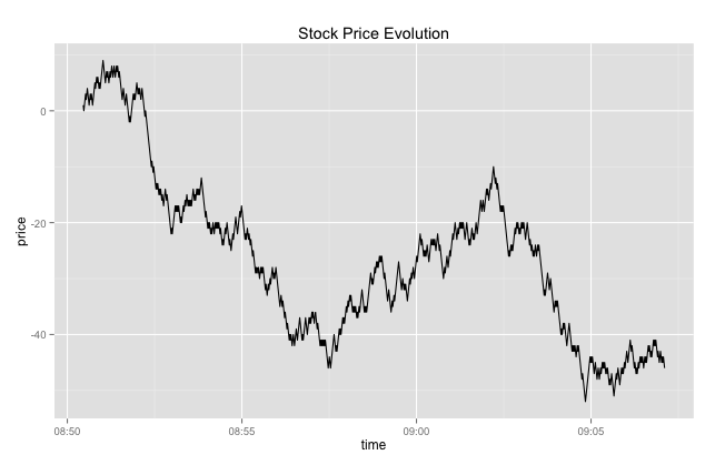
Then plot a simple line graph - remember ggplot2 works natively with data frames:
[source lang="r"]>library(ggplot2)
>ggplot(tab, aes(x=time, y=price)) + geom_line()
+ ggtitle("Stock Price Evolution")[/source]
This will produce a line graph similar to the one below:
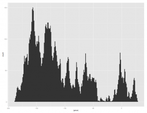
Next, we can do a simple bin count / histogram on the price series:
[source lang="r"]ggplot(tab, aes(x=(price))) + geom_histogram()[/source]
Which will produce a graph like the following:
We can adjust the bin width to get a more granular graph using the binwidth parameter:
[source lang="r"]> ggplot(tab, aes(x=(price)))
+ geom_histogram(position="identity", binwidth=1)[/source]
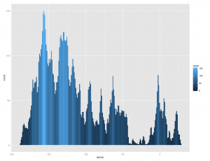
We can also make use of some aesthetic attributes, e.g. fill color - we can shade the histogram by the number of observations in each bin:
[source lang="r"]ggplot(tab, aes(x=(price), fill=..count..))
+ geom_histogram(position="identity", binwidth=1)[/source]
Which results in:
Some other graphs: Say I have a data frame with a bunch of currency tick data (bid/offer/mid prices). The currencies are interspersed. Here is a sample:
[source lang="r"]
> head(ccys)
sym timestamp bid ask mid
1 AUDJPY 2013-01-15 11:00:16.127 94.485 94.496 94.4905
2 AUDJPY 2013-01-15 11:00:22.592 94.486 94.496 94.4910
3 AUDJPY 2013-01-15 11:00:30.117 94.498 94.505 94.5015
4 AUDJPY 2013-01-15 11:00:30.325 94.498 94.506 94.5020
5 AUDJPY 2013-01-15 11:00:37.118 94.499 94.507 94.5030
6 AUDJPY 2013-01-15 11:00:47.348 94.526 94.536 94.5310
[/source]
I want to add a column containing the log-returns calculated separately for each currency:
[source lang="r"]
log.ret <- function(x)
do.call("rbind",
lapply(seq_along(x),
function(i)
cbind(x[[i]],lr=c(0, diff(log(x[[i]]$mid))))))
ccys <- log.ret(split(ccys, f=ccys$sym))
[/source]
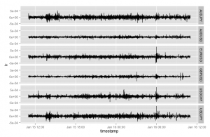
Then I can plot a simple line chart of the log returns using the lovely facets feature in ggplot to split out a separate panel per symbol:
[source lang="r"]
ggplot(ccys, aes(x=timestamp, y=lr))
+ geom_line()
+ facet_grid(sym ~ .)
[/source]
Which produces the following:
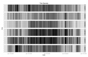
Another nice graph - display a visual summary of the tick frequency by time. This one uses a dummy column that represents a tick arrival. Note in the following graph I have reduced the line width and set the alpha value to a tiny value (creating a large transparency effect) as otherwise the density of tick lines is too great. The overall effect is visually pleasing:
[source lang="r"]
ccys <- cbind(ccys, dummy=rep(1,nrow(ccys)))
ggplot(ccys, aes(x=timestamp,y=dummy, ymin=0, ymax=1))
+ geom_linerange(alpha=1/2,size=.01,width=.01)
+ facet_grid(sym ~ .)
+ theme(axis.text.y=element_blank())
+ xlab("ticks") + ylab("time")
+ ggtitle("Tick Density")
[/source]
Which results in:
Next time (time permitting) - covariance matrices and bivariate density plots..
